Uncovering why new customers couldn't sign up to Sparks Days Out
A moderated usability study across 15 participants that revealed critical gaps in comprehension and journey clarity — and fed directly into a full page redesign brief.
My Role
UX Researcher Discussion Guide Author
Method
Moderated Remote Usability Testing (Zoom)
Participants
13–15 new users across the UK
Overview
A loyalty benefit tangled in a third-party journey
Sparks Days Out gives M&S Sparks customers access to discounts on UK days out — theme parks, zoos, cinema and more — unlocked by spending £35 on clothing or homeware. The benefit is delivered through a third-party platform (Kids Pass), making the sign-up journey more complex than a standard loyalty perk.
I joined a cross-functional team to find out whether the existing acquisition page was actually working — and to build the evidence needed to justify a redesign.
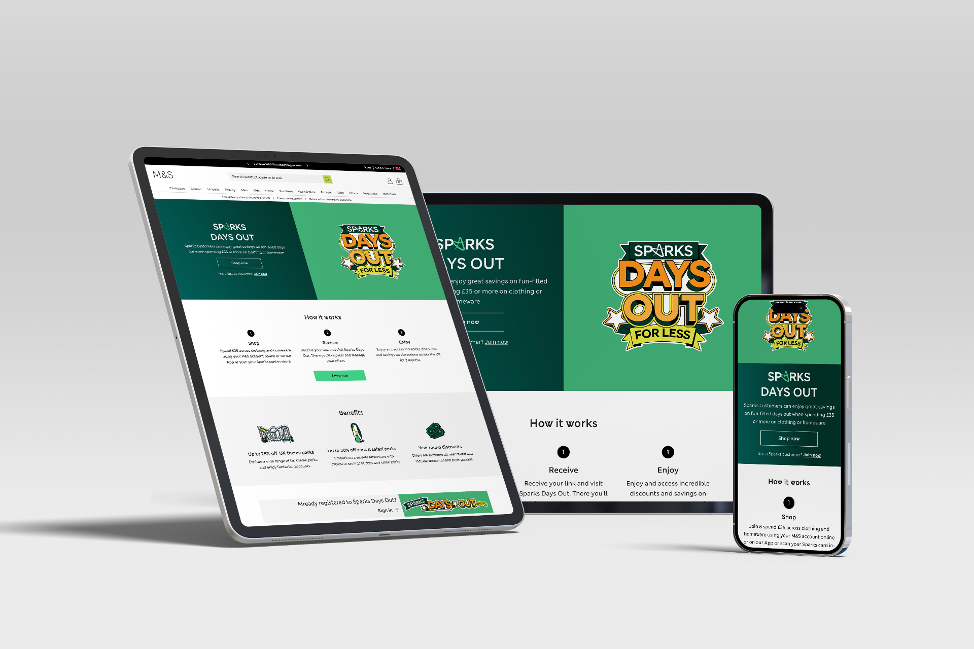
The Sparks Days Out acquisition page — the journey under test
Research
Can a new user land here, understand the offer, and sign up?
That was the single question framing the study. I wrote the discussion guide and facilitated 13–15 moderated remote sessions over Zoom — observing in real time how users read the page, where they hesitated, and where they gave up or lost confidence.
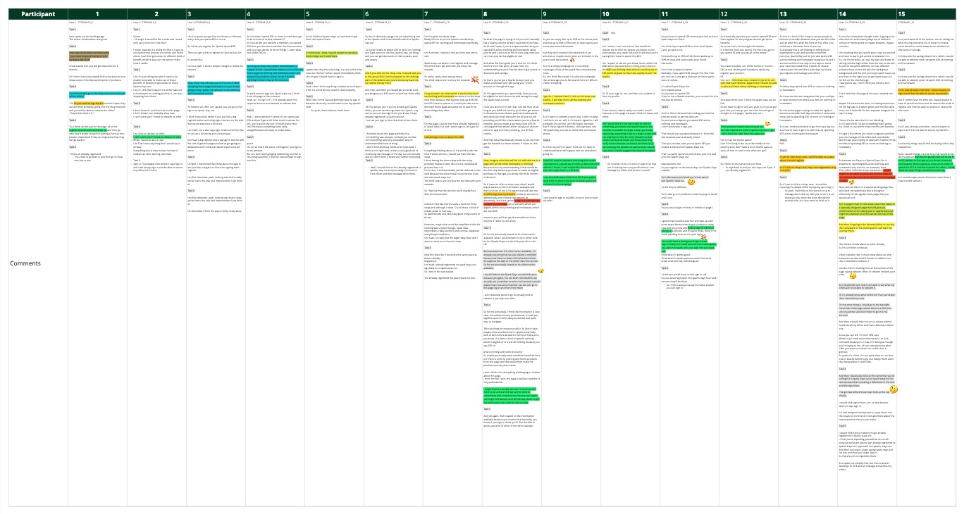
The research board below maps participant responses across the full journey, from first impressions of the page through to Kids Pass registration and discount redemption.
15
Participants tested across the full journey
1
Core research question driving the study
3
Critical friction points uncovered
What we found
For most participants, the answer was no
Synthesis surfaced three recurring friction points that consistently blocked users from completing the journey — none of which were immediately obvious from looking at the page in isolation.
- 1
The M&S–Kids Pass connection wasn't clear. Users couldn't understand why clicking through from an M&S page took them to a third-party platform. Several participants assumed it was an error or abandoned the flow entirely at this point.
- 2
The £35 spend requirement wasn't landing as a trigger, it felt like small print. Users read the page without registering that they needed to spend first. The value proposition came before the eligibility condition, so motivation arrived before comprehension.
- 3
New and returning customers weren't differentiated. Both groups were served the same page with no clear signposting — causing confusion about whether they were already registered and what step to take next.
What followed
Research findings fed directly into a redesign brief
With the usability evidence in place, the team was briefed to redesign the Sparks Days Out web pages — using the research to prioritise what needed to change and why.
Step 01
Spend
Spend £35 on clothing or homeware online or in-store using your Sparks account
Step 02
Register
Receive your unique link and register on Sparks Days Out to unlock your discounts
Step 03
Enjoy
Access savings on days out across the UK — theme parks, zoos, cinema and more
The brief called for a simplified step-by-step structure, reduced copy, more prominent CTAs, clearer signposting between new and existing customers, and better representation that Sparks Days Out is for all ages — not just families.
Outcomes
Evidence that moved the brief forward
🎯
Clear direction for redesign
Research findings provided a specific, evidenced rationale for each design decision in the redesign brief — moving the team away from assumptions.
🗺️
Journey gaps made visible
The user flow from M&S spend through to Kids Pass redemption was mapped and annotated with friction points, giving the team a shared picture of where the experience broke down.
📋
A brief grounded in behaviour, not opinion
Rather than redesigning based on stakeholder preference, the team had 15 sessions of real user behaviour to draw from. The step-by-step structure (Spend → Register → Enjoy), the eligibility messaging hierarchy, and the new vs. returning customer split were all directly informed by what participants struggled with in the test.
Skills & tools