Progress Pulse for Runna
Most beginner runners quit by week 4 — not because the plan is wrong, but because progress feels invisible. Runna captures all the data a beginner needs to feel themselves improving. It just never tells them.
My Role
Product Designer
Subscribers
1M+ Runners
Funding Raised
$10.3M
Retention Goal
Beginner LTV
Business context
Runna is a venture-backed running coaching app that has raised $10.3M in funding, including a £5M Series A led by JamJar Investments — the fund behind Innocent Drinks. It operates on a pure subscription model with no advertising revenue, which means every user who cancels is a direct hit to LTV.
Following Series A, Runna's priority shifted from survival to scaling. Retaining beginners past their first training block became a critical commercial lever — and the product wasn't designed for it.
$10.3M
Total VC funding raised since 2021
£5M
Series A led by JamJar Investments
~£15/mo
Premium subscription — no ads, pure retention play
The problem
Data exists. Felt progress doesn't.
Runna has pace data, heart rate trends, distance history, and run completion records. A human coach would look at those numbers after four weeks and say: "you're running the same distance at a lower heart rate — that's real fitness." Runna shows the numbers and moves on.
This isn't a data problem. It's a communication design problem — and it's happening at exactly the moment when a beginner most needs to feel that continuing is worth it.
YouTube comments
Review videos and Runna walkthroughs — individual voices, unfiltered reactions
Reddit threads
r/runna and r/AdvancedRunning — community discussions about experience and dropout
Trustpilot reviews
1-star and 5-star reviews — emotional extremes where insight lives
Design brief
How Might We
I generated six HMW statements from the research clusters and pressure-tested each against user pain intensity, design surface richness, and market novelty. The strongest combined the progress visibility and missed run themes. Then I refined it to include the business goal and technical constraints that make it actionable in a real product team.
How might Runna make progress feel real and continuous for beginners in their first 8 weeks — especially when they miss a run or fall behind?
How might Runna reduce week 4 churn by making progress visible to beginners — using only data already captured — without adding complexity to the core plan experience?
From brief to screens
How I got from the HMW to three touchpoints
Before sketching anything I mapped three territories the brief could live in, chose the one with the richest design surface and most direct connection to the retention goal, then used the emotional journey map to identify the three specific moments the app was failing. Those moments became the touchpoints.
01
Three territories mapped
Progress visualisation · Missed run response · Weekly coaching recap
Explored before any screens were drawn
02
Territory 1 chosen
Richest design surface. Most direct connection to the churn goal. Data already exists in the product.
Missed run response logged as v2 scope
03
Journey map → 3 moments
Week 1 run 1 · Post-run screen · Week 4 home screen
Each moment became one touchpoint
Ruled out at scoping:
AI-generated messagesSleep / recovery dataSocial comparisonNew navigation tabEach ruled out to keep engineering cost realistic and protect the product's core strength — simplicity.
The solution
Progress Pulse — 3 touchpoints
A lightweight progress layer inside Runna's existing UI. No new navigation. No new data sources. Designed to feel native to the product — not bolted on.
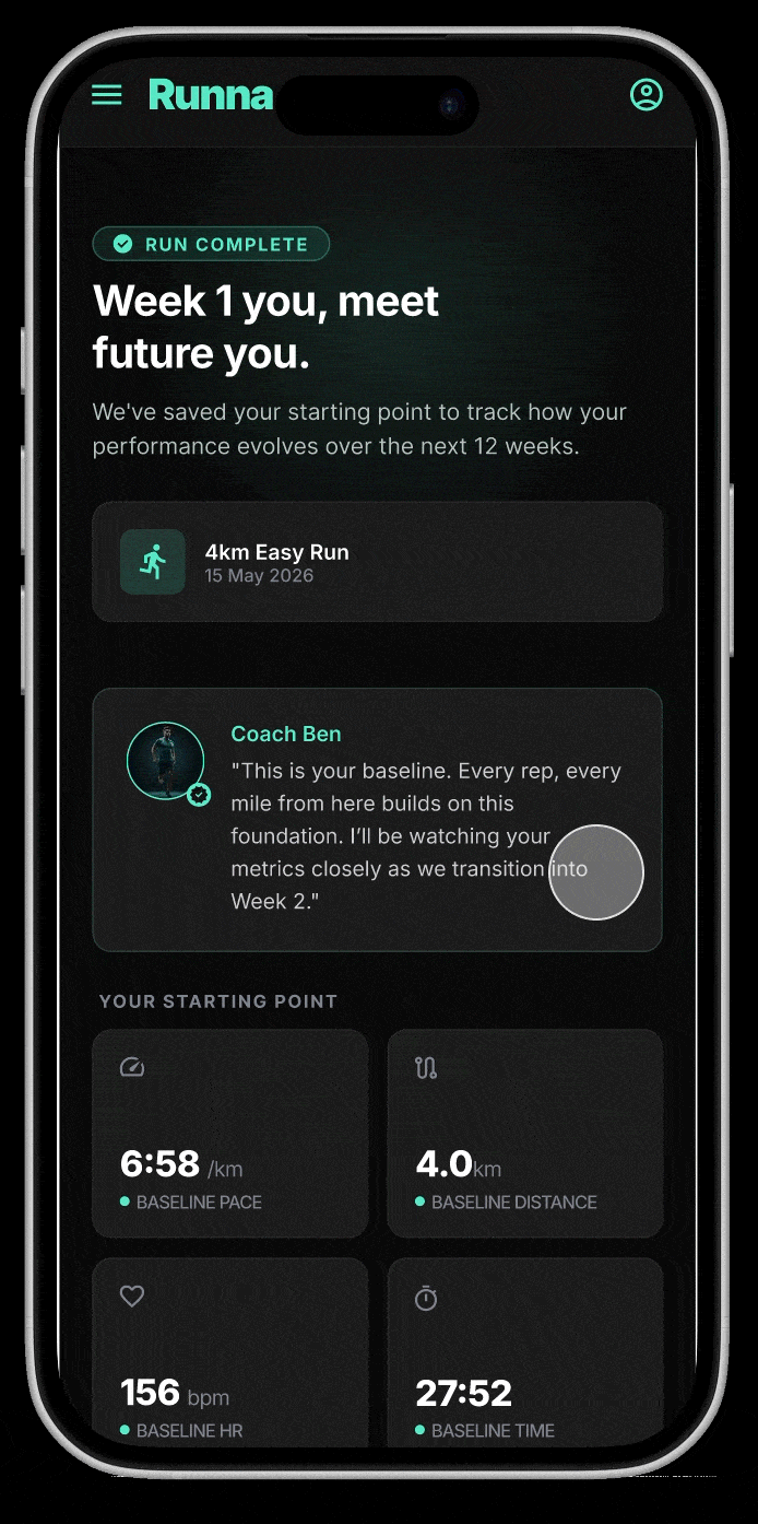
- 01Baseline snapshot — Fires once after run 1. Captures pace, distance and heart rate as the anchor. Three design variations — each driven by a different behavioural bias.
- 02Post-run milestone moment — Triggers when the app detects a personal best or significant improvement. Surfaces the insight the runner couldn't have noticed themselves.
- 03Weekly progress card — Lives on the home screen in the existing My Insights slot. Updates each week. Designed specifically for week 4 — the highest dropout point.
Deliberately out of scope
Each ruled out to keep engineering cost realistic and protect the product's core strength — simplicity.
Section 02
Understanding Runna
Before designing anything, I audited the existing product — its visual system, interaction patterns, and what it already does well. Designing within the system rather than on top of it was a non-negotiable constraint.
What Runna does well
Honest strengths
A good audit isn't a list of problems. Runna has genuine strengths — and understanding them was essential to designing a feature that respects the product rather than fighting it.
Structure removes decision fatigue
"I love it because I am a newbie and don't know what a good running plan needs." Beginners repeatedly cited the plan structure as the primary reason they stayed. Any new feature must protect this simplicity.
Watch sync is genuinely frictionless
"Workouts syncing right to my watch has really been the main reason I've been continuing." The data pipeline is already there — Progress Pulse just uses it differently.
Coaching language is warm and specific
Ben Parker's pre-run briefings set a tone most fitness apps don't have. Progress Pulse was designed to extend this voice, not introduce a new one.
The gap identified
One clear problem statement
After auditing the UI and synthesising the research, the gap wasn't about missing features. It was about a missing translation layer between data and feeling.
Runna collects all the data a beginner needs to feel progress — but never translates it into felt improvement.
The app has pace data, heart rate trends, distance history, and completion records. A human coach would look at those numbers and say "you're running the same distance at a lower heart rate than four weeks ago — that's real fitness." Runna shows the numbers and moves on. This isn't a data problem. It's a communication design problem — and it's happening at exactly the moment when a beginner most needs to feel that continuing is worth it.
Evidenced by
Theme 2 — progress invisible until race day
Confirmed by
Journey map — week 4 emotional gap
Reinforced by
Theme 4 — AI claim vs algorithm reality
Competitive landscape
How competitors handle progress & motivation
Before designing anything, I mapped how Runna's four closest competitors handle progress visualisation and motivational design for beginner runners. The pattern is consistent: the market is good at tracking. Nobody is good at translating.
Sources: app store listings, independent reviews (2025–2026), Strava product announcements, Garmin Coach documentation.
Runna
£15.99/mo
Nike Run Club
Free
Garmin Coach
Free (watch req.)
Strava
Free / £6.99/mo
Target user
Structured plan runners
Casual / beginner
Data-driven / watch owners
All levels, social
Baseline capture on first run
Week-on-week pace trend
Progress vs personal starting point
Milestone detection & celebration
Post-run celebration screen
The white space
Across all four apps, not one translates raw data into felt progress for a beginner. Strava has the richest data set but requires running knowledge to interpret it. Garmin Coach has the most sophisticated tracking but surfaces it as numbers, not narrative. Nike Run Club celebrates milestones well but has no structured plan context to make them meaningful. Runna has the plan data, the coaching voice, and the watch integration — it's missing only the translation layer. That's the market gap Progress Pulse is designed to close.
Research limitations
If I had done primary research
This project was built on secondary research — 20 sources across YouTube, Reddit and Trustpilot. For a speculative portfolio project that is a legitimate approach. In a real product context I would have validated the insight clusters against primary data before designing anything.
Research limitation acknowledged. Secondary research identifies patterns at scale but misses the emotional texture of individual experience. A real product team would follow this synthesis with 6 to 8 user interviews to pressure-test the insight clusters before committing to a design direction.
The 5 questions I would have asked
Tap any question to see the research rationale behind it
What I would have done with the answers
Four things primary research would have changed
Validate or invalidate the 5 insight clusters
Checking whether themes from secondary research held up in individual conversations — or were platform-specific noise.
Pressure-test the week 4 dropout hypothesis
Asking about specific moments rather than assuming the secondary data pattern holds universally across all users.
Map what feeling fitter means to a beginner
Q1 and Q5 together reveal whether the problem is invisible progress or undefined progress. The design response to each is different.
Identify the right tone for coaching language
Q1 and Q2 surface whether users want warmth, expertise, or just clarity. Getting this wrong undermines the whole feature.
Section 04 · Part 2
AI prompt documentation
Three prompts that did the most work in this project. For each one: the exact prompt used, what the AI returned, and — most importantly — what I kept, what I changed, and why. That last column is where design judgement lives.
What a well-structured design prompt looks like
Each prompt I wrote had four parts: context, task, format constraints, and a final instruction. This structure produced consistently more useful output than open-ended questions.
Context: I have 5 insight clusters from Runna user research. The app's core problem is that beginners can't feel themselves improving and quit around week 4.
Task: Generate one HMW statement per insight cluster. Each should be specific enough to design against — not "improve motivation" but a concrete user moment.
Then: For each HMW, score it on three criteria:
— User pain intensity (1–5)
— Design surface richness (1–5) [how much is there to actually design?]
— Market novelty (1–5) [how poorly do competitors solve this?]
Finally: Recommend the strongest HMW and explain your reasoning.
Why this structure works
Context first
Gives the AI the problem frame before it generates anything. Without it, output defaults to generic fitness app thinking.
Concrete constraints
"Specific enough to design against" rules out vague statements before the AI writes a single one.
Scoring criteria
Forces a framework onto the output so I can compare options objectively rather than going with whatever feels right.
Explicit recommendation
Asking AI to commit to a recommendation surfaces its reasoning — which I can then challenge or build on.
All three prompts — expanded
What I learned
4 principles for using AI in a design process
Drawn from what actually worked — and what didn't — across the full project.
- →AI is good at breadth, weak at depth: It surfaces options quickly but the design specificity — what the screen actually says, shows, and feels like — has to come from you.
- →Constraints in prompts produce better output: "Generate themes" produces generic output. "Generate themes, flag anything appearing in fewer than 3 sources as weak signal" produces something you can trust.
- →Always add the dimension AI misses: In research: specificity. In HMWs: business goals. In design directions: the actual screen decisions. AI optimises for what you ask — you have to ask for what matters.
- →Document the rejection, not just the acceptance: What you didn't use from the AI output — and why — is as important as what you kept. It proves taste and judgement, not just speed.
Section 04 · Part 3
User flow — where Progress Pulse lives
One of the first decisions I made was to design within Runna's existing navigation rather than introduce new screens or tabs. This flow shows exactly where each of the three touchpoints interrupts or extends the existing user journey — and why each placement was deliberate.
Onboarding complete
Home screen — week 1
Workout detail screen
Run recorded
Touchpoint 1
Baseline snapshot
First run only · captures starting point
Week 1, run 1
Home screen — week 2+
Workout detail screen
Milestone triggered?
Run recorded
week loop
yes
Touchpoint 2
Post-run moment
Every run · milestone triggered
Every run
Home screen
My progress card visible
Touchpoint 3
Weekly progress card
End of each week · coaching summary
End of week
Why each touchpoint is placed where it is
- →Touchpoint 1 fires immediately after run 1 — not on the home screen because a baseline needs to feel like a moment, not a setting. Interrupting the return-to-home flow creates the emotional weight the data capture deserves.
- →Touchpoint 2 replaces the empty post-run screen — Runna currently returns straight to home after a completed workout. This is the single biggest missed moment in the product. Progress Pulse occupies it without adding new navigation.
- →Touchpoint 3 lives in the existing 'My Insights' slot on the home screen — that section already exists but is empty for new users in week 1. Progress Pulse fills it without requiring a new tab or navigation item. Designing within the existing structure was a hard constraint.
Section 04 · Part 4
Behavioural science — three design directions
Rather than iterating on aesthetics, I used behavioural science to generate three structurally distinct directions for the baseline snapshot screen — each driven by a different cognitive bias from thedecisionlab.com/biases. The goal was artificial divergence: making sure I was choosing a direction, not defaulting to the first idea.
The three variations
People stay motivated when they see themselves as the hero of a story. The screen opens with 'Chapter 1 of 11' — locked future chapters create narrative tension that makes quitting feel like closing a book mid-chapter.
Begin chapter 2 →
The first number seen becomes the reference point for everything after. A single 80px pace value dominates the screen — burned into memory so every faster future run feels like a personal win.
Lock it in →
People value things more once they feel ownership over them. Data capture is reframed as acquisition — 'Yours forever', 'Never deleted', 'Locked in' — making the user reluctant to abandon something that now belongs to them.
Lock it in →
My recommendation
The anchoring screen is the strongest for Runna's specific context — a premium, data-rich product used by beginners who need confidence, not a story.
- →It does the most work without requiring reading — the 80px pace number anchors the user before they've processed a single word. V1 requires reading the chapter framing to land. V2 lands in under a second.
- →It directly supports the retention goal — anchoring creates an involuntary reference point. Every time the user checks their pace, they compare it to 6:58 without the app prompting them. That's passive retention — exactly what a subscription product needs.
- →V3's best ideas are absorbed into V2 — 'Yours forever' and 'Michael's baseline — Never deleted' from the endowment effect variation layer directly onto V2. In production I'd ship the merged version.
Why not the others
V1 — Narrative bias
The chapter metaphor requires the rest of the app to sustain it. If week 2 doesn't feel like chapter 2, the promise breaks — too large a scope change for a single feature.
V3 — Endowment effect
Strongest as a language layer, weakest as a standalone layout. Its best ideas ('Yours forever', 'Locked in') are absorbed into the V2 recommendation.
The solution
Three directions, three cognitive biases
Rather than iterating on aesthetics, I used behavioural science to generate three structurally distinct screen directions — each anchored to a different cognitive bias — to force genuine divergence and ensure I was making a deliberate design choice rather than defaulting to the first idea.
One leans on narrative bias, framing the journey as an unfolding story the user doesn't want to leave unfinished; another uses anchoring bias, leading with a single dominant number that becomes the benchmark every future run is measured against; the third applies the endowment effect, reframing data capture as personal ownership so users feel reluctant to walk away from something that already feels theirs.