Onboarding Digital Rewards
Redesigning the M&S Banking app experience to help users understand, connect, and engage with the Digital Rewards programme from first discovery through to account linking.
Michael Ogunsakin
David Orrrige
Senior Product Owner
Senior Product Owner
My Role
Product Designer
Users Impacted
3M+ Customers
Activation Lift
+18%
Programme Value
£40M Rewards
I led the research and usability testing for this project. Rather than directing participants, I had them talk through the prototype in their own words observing where the flow broke down and where it didn't. The visual design and technical implementation were collaborative.
Each iteration tested a different balance of copy weight, layout structure, and CTA prominence with the aim of driving engagement without overwhelming the user.
Decisions moved through multiple layers of approval, which shaped how solutions were framed and presented internally. This made research findings particularly important as an objective anchor for design decisions.
The brief
This while working on the M&S Bank product team, where my focus was improving the onboarding screens responsible for account linking inside the Digital Rewards programme. The work touched discovery, comprehension, and the first transactional moment users have with the rewards experience.
Every design decision was grounded in existing user comprehension what people already understood about rewards, vouchers, and Sparks rather than reinventing mental models. The goal was clarity, not novelty.
User testing
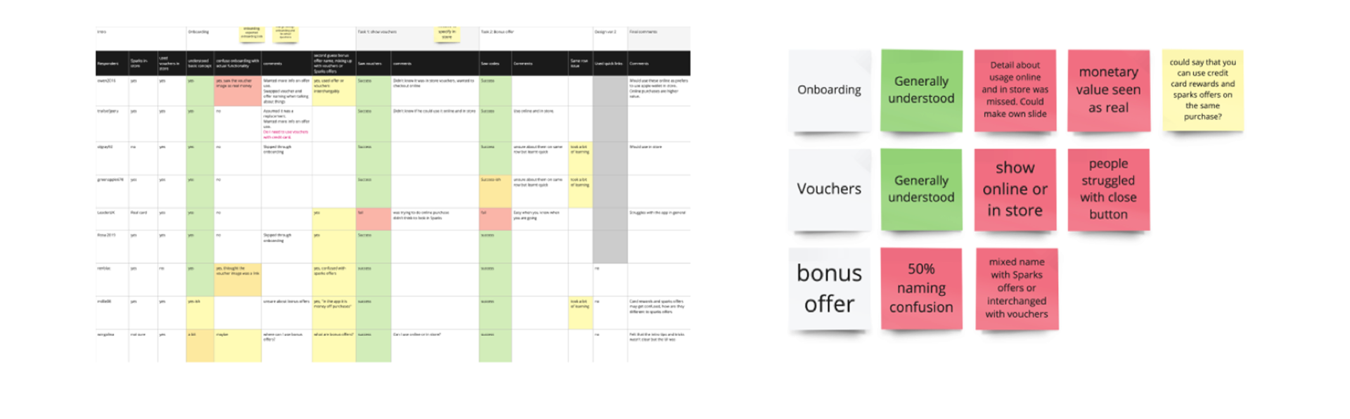
Existing user-testing material was used to inform design decisions and avoid making assumptions about user behaviour. Three insight areas shaped the work directly.
The monetary value of rewards wasn't perceived as real or tangible during the first-time experience.
Users needed clearer guidance on how vouchers worked across online and in-store contexts.
Naming caused confusion — bonus offers were easily mistaken for standard offers.
This approach kept me targeted and impartial. Rather than designing based on what I thought users needed, the research provided a clear foundation.
Acquisition branding
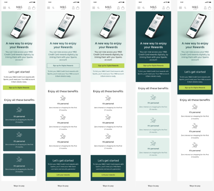
I created multiple UI iterations of the Sparks hub to explore how hierarchy, visual weight, and density influenced what users noticed first. The aim was to find the version that felt impactful without becoming noisy.
The hardest part was restraint — keeping copy succinct, CTA-focused, and free of redundant signposting. Every removed sentence made the remaining ones clearer.
From broken flow to clear journey
The redesign focused on one goal: make the path from email to active Sparks account impossible to lose. Three screens, a clear progress stepper, and a reward-forward confirmation that gives users an immediate reason to complete the flow.
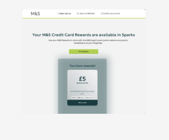
App Store and Google Play badges only appear on the success screen after the reward is confirmed. Asking earlier would have introduced friction before trust was established.
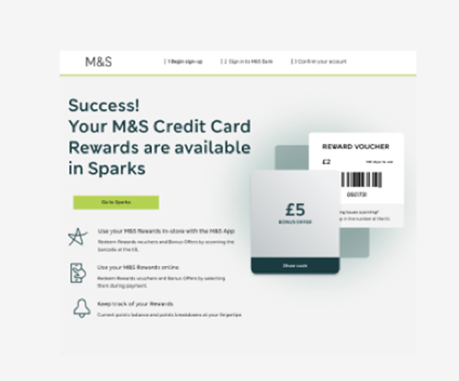
Three benefit icons explain what Sparks unlocks — in store, online, and tracking. Sets expectations before the app download ask.
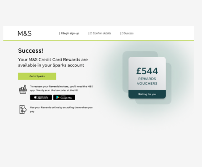
Full reward value displayed. App Store and Google Play badges appear at the moment of highest motivation — immediately after the reward is confirmed.
Design decisions
Users always know where they are and how much is left. Research showed the original flow had no signposting — users didn't know if they were halfway through or just starting.
The voucher card appears on screen 1, before the user has committed to anything. This addresses the drop-off caused by users not understanding what they'd receive.
App Store and Google Play badges only appear on the success screen — after the reward is confirmed. Asking earlier would have introduced friction before trust was established.