Redesigning error messages for M&S self-service checkouts
A research-led UX initiative to reduce colleague interventions, improve customer confidence, and bring consistency to the 40+ error states across the SCOTs till system.
My Role
Product Designer
Stores Live
1,000+ UK
SCOTs till UI
−20%
Error States
40+ Unified
Team
I worked as one of two UX designers on this project, collaborating closely with a product manager and an engineer throughout research, design, and handoff.
The problem
Roughly 20% of all M&S self-service checkout transactions required a colleague to step in and assist. The brief was clear: the error messages customers encountered were confusing, inconsistent, and often failed to tell them what to do next. With over 40 error states across the SCOTs till system, there was no unified logic governing when each message type should appear, what language it should use, or how urgent it should feel.
Research & discovery
Understanding the full scope
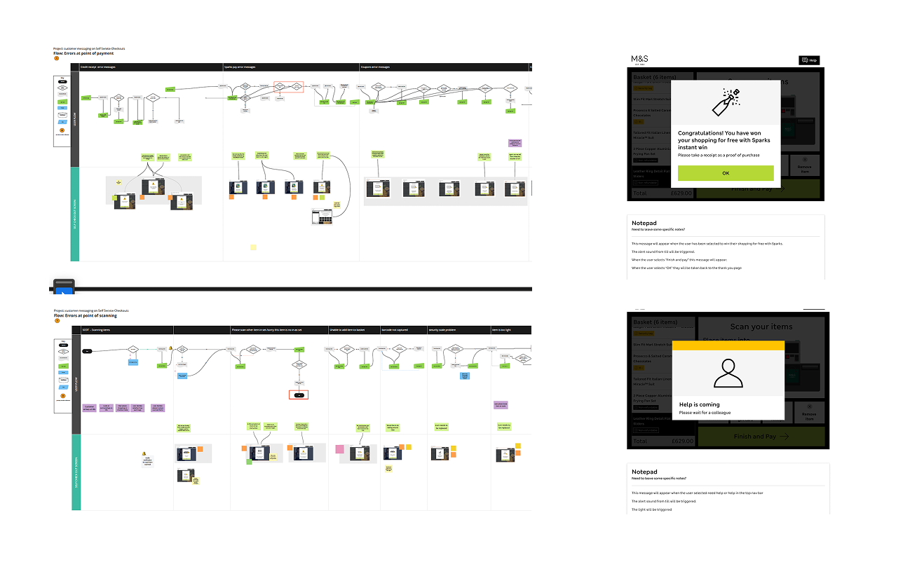
My first step was to audit every existing error state and map them by where they occurred in the customer journey. This gave the team a shared picture of the problem before any design decisions were made.
System errors
App failures and unexpected states outside customer control
Scan errors
Unrecognised items, weight checks, 2D barcodes, loose produce
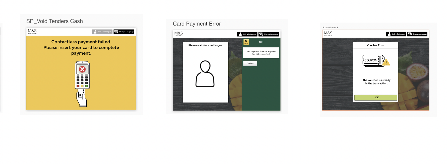
Payment errors
Declined cards, contactless failures, Sparks Pay, voucher errors
I also reviewed prior in-store research from CLX identifying hardware and interface pain points — small fonts, confusing amber light states, tagged items causing transaction stalls — and conducted a heuristic review against Nielsen Norman error message guidelines.
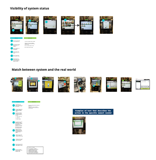
The heuristic review revealed two consistent failures across the existing 40+ states. First, visibility of system status — several error screens gave customers no indication of what had gone wrong or whether the till was still processing, leaving them to wait with no feedback loop. Second, match between system and the real world — error copy frequently used internal system language ("error code 4061", "void tenders cash") that had no meaning to a customer standing at a checkout. These two findings became the foundation for the copy rules applied across all redesigned states: every message had to name the problem in plain language, and every message had to tell the customer what to do next.
Research methods
How I gathered insight
Desk research — Nielsen Norman
Used NN/g error principles as a framework to evaluate existing copy: explicit, human-readable, polite, precise, and constructive.
Heuristic review
Evaluated SCOTs UI against usability heuristics — particularly visibility of system status and real-world language match.
In-store observations (CLX)
Reviewed existing store observation reports capturing real customer behaviour and confusion points at self-checkout.
User testing — Zoom & in-store intercepts
Tested prototypes with real customers end-to-end. Participants showed a noticeably higher understanding of redesigned messages vs. existing designs.
Design thinking
Building a system, not just screens
Rather than redesigning individual error states in isolation, I focused on defining the logic that would govern all of them — a taxonomy where each error type had clear behavioural rules, so future messages could be placed into the right pattern by default.
- →Full screen / critical: Chosen for payment failures and system errors because these states block the entire transaction. Taking over the full UI with a yellow background signals urgency to both the customer and any nearby colleague, and prevents the user from interacting with a till that cannot currently process their action.
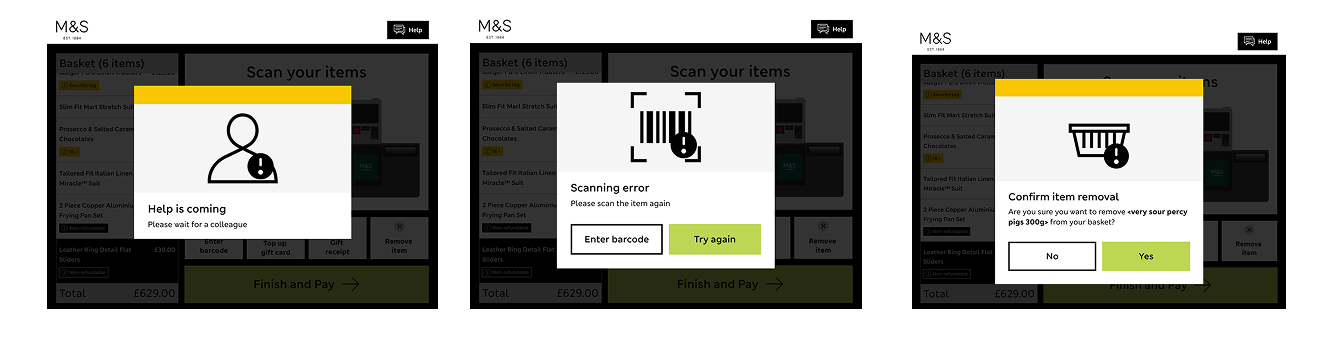
- →Pop-up alert: Used for interrupts that require a decision but don't stop the whole transaction — such as age verification or item substitution. A grey mask overlay communicates that the current flow is paused without abandoning it, keeping the customer's basket and context intact.
- →Interrupter: Reserved for states requiring physical action — like re-scanning an item or placing goods in the bagging area. These require no on-screen CTA and auto-escalate after one minute of inactivity, because any further digital prompt would be redundant if the customer has already stepped away.
Each error state was documented with explicit trigger rules — the exact condition under which it appears — to remove ambiguity during engineering handoff.
Accessibility
Accessibility was built into the error taxonomy from the start. Given that self-service checkouts are used by customers with a wide range of needs — including those with low vision, cognitive differences, or motor impairments — each error state was reviewed against the M&S in-house accessibility framework. Colour was never used as the sole indicator of error severity; the yellow full-screen state was always accompanied by explicit header copy and a primary CTA. Touch target sizes on dismissal buttons were specified to meet minimum interactive element requirements, and the reading order of each error component was documented for developer handoff to ensure screen reader compatibility where applicable.
Outcomes
The redesigned error system was delivered live into M&S stores nationally. By establishing explicit trigger rules for each of the three message types — and replacing ambiguous system codes with plain, action-oriented language — the design removed the primary reason customers were unable to self-serve: not knowing what the error meant or what to do next.
Shipped
Redesigned error states are live in M&S stores nationally across the SCOTs system.
User testing
Prototype testing showed a measurable improvement in customer comprehension — participants could correctly identify what had gone wrong and what action to take, compared to the existing states where the most common response was to call a colleague.
Design system
A unified error state taxonomy was delivered for engineering handoff, covering all five message types (confirmation, success, warning, error, system) with explicit trigger conditions, dismissal rules, copy constraints, and accessibility specifications — removing the ambiguity that had previously led to inconsistent implementation across till variants.
Skills & tools