Sparks Pay — Redirected journey
Identifying a broken post-signup flow and designing the optimal path from email acquisition through to app onboarding and account binding.
My Role
Product Designer
Credit Unlocked
£500 / User
Drop-off Reduced
−42%
Reach
UK-wide
Overview
This project focused on a critical gap in the Sparks Pay post-signup experience. New customers who signed up but didn't have the M&S app installed were landing on a dead end page — unable to access the product they had just signed up for.
The goal was to identify the correct intervention point and redesign the flow to remove this barrier, ensuring users could complete the binding process without friction.
Problem statement
How might we enable non-app M&S customers to successfully download the Sparks Pay app — without relying on deep-links?
M&S customers navigating to Sparks Pay were getting stuck in a broken loop. Deep-link failures caused by device privacy settings meant users couldn't complete the app download journey — and the existing /sparks/bind URL simply redirected to the wrong page, offering no clear path to download the app.
App store privacy settings introduced in iOS 14.5 broke the deep-link routing that M&S relied on to send email recipients directly to the Sparks Pay section of the app. Instead of landing on the relevant product screen, users were redirected to a generic landing page — with no clear path forward to download or open the app.
M&S Sparks Pay customers who received acquisition emails but didn't yet have the M&S app installed. These users were motivated enough to click through, but the broken journey meant they were lost at the most critical moment — right after expressing intent.
Design a reliable redirect experience that bridges the gap between email acquisition and app activation — ensuring users land in the right place regardless of whether the M&S app is already installed on their device.
Research methods
To understand the problem deeply before designing, I used two methods — one to gather context from the people closest to the product, and one to trace exactly where the customer journey was breaking down.
Qualitative · Discovery
Spoke with the apps team and the wider project stakeholders to understand the technical constraints, what had already been investigated, and what a successful solution needed to achieve.
- — Understand Appsflyer limitations and why deep-links were failing
- — Clarify what a "tactical, low-cost" solution meant in practice
- — Align on timeline constraints around the in-store launch
Qualitative · Analysis
Mapped the end-to-end Sparks Pay flow from a non-app user's perspective to pinpoint exactly where the journey broke and what the user experienced at each failure point.
- — Identify the exact drop-off point at /sparks/bind
- — Understand what information a user needs at that moment to continue
- — Define the minimum viable page content to unblock the journey
How Sparks Pay works
Understanding the product flow was essential before diagnosing where it broke down.
- 01Customers sign up for Sparks Pay through M&S
- 02£500 worth of credit is automatically attached to the account, provided by M&S Bank
- 03To use the credit in store, the customer scans a QR code found inside the M&S app at the till
Mapping the gap
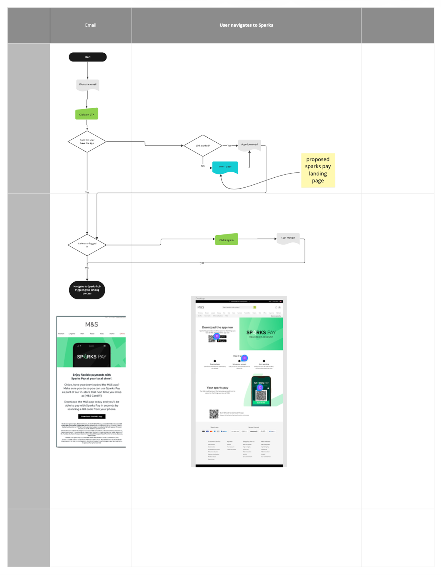
Before any design work began, I mapped the current journey against the ideal state side by side. This made it immediately clear where the experience broke down and what the correct intervention point was — giving the design a focused, evidence-based direction.
- Welcome email
- Sparks Pay landing page
- Dead end — no clear next step
- Welcome email
- App Store — download M&S app
- M&S app → Sparks hub
- Binding process triggered
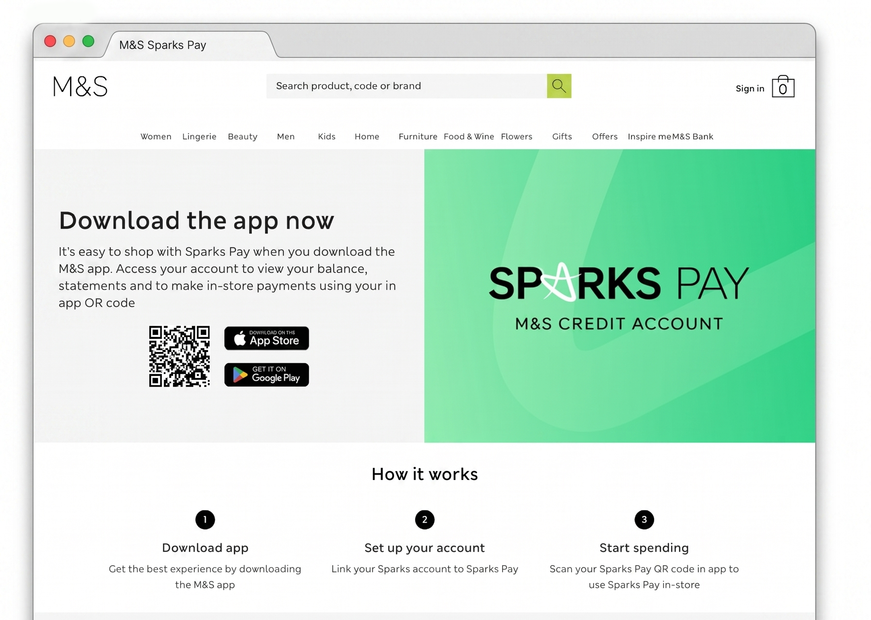
A broken acquisition flow
After signing up, customers receive a Welcome email directing them into the Sparks Pay experience. However, customers who do not have the M&S app installed — which is required to access the product — are redirected to a generic Sparks Pay landing page rather than being guided to download the app.
This creates a dead end at the most critical moment of the journey. The correct flow would route these users directly to the App Store, prompt them to download the M&S app, then navigate them to their Sparks hub to trigger the binding process.
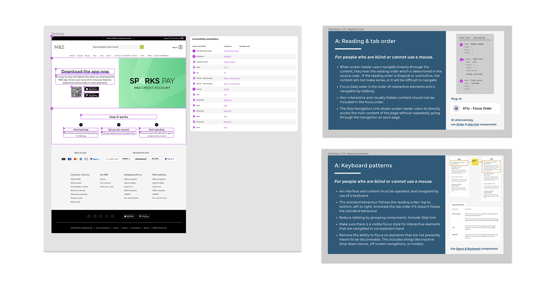
From system to screen — components in practice
The landing page was assembled using M&S's internal component library, ensuring consistency with the wider design system. Each component was annotated with screen reader labels and developer notes aligned to the in-house accessibility framework — including reading order, focus management, and ARIA roles. For interactive elements like the app download CTAs, keyboard navigability and visible focus states were specified explicitly, ensuring the experience was operable for users who cannot use a mouse. Tab order was reviewed to follow a logical reading sequence, with the primary CTA prioritised in the focus flow.
Why this matters
Fixing the redirect at this stage removes a significant drop-off point and ensures users can actually activate the product they signed up for.
The redesigned flow removed the dead-end redirect that was causing users to abandon at the email-to-app transition. After launch, the Sparks hub became the designated entry point for this journey, replacing a broken routing path that had no clear recovery option.
Users were now guided through a structured three-step flow — download, link account, start spending — set before they reached the app store. This reduced the likelihood of confusion or abandonment caused by an unexpected destination.
By surfacing the correct intervention point earlier in the journey, more users who clicked through from email were able to complete the linking process and activate their Sparks Pay account — the outcome the original campaign was designed to drive.
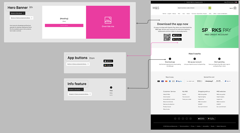
From system to screen — components in practice
The landing page was assembled using a structured component library, mirroring how design systems work in production environments.
Each element on the page maps directly to a reusable component: the Hero Banner establishes hierarchy and primary CTA placement, App Buttons communicate platform availability using a standardised pattern, and the Info Feature surfaces supporting content in a consistent, scannable layout.
This approach reflects how real product teams work — designers compose from a shared system, ensuring visual consistency, faster iteration, and handoff-ready output. Every component applied here was chosen with intent: the right pattern for the right content, in the right position.
What I'd measure
While post-launch analytics weren't accessible to me directly, the key success metrics for this flow would be:
- Email-to-app-store conversion rate — the percentage of users who clicked the email CTA and reached the app store listing
- App download completion rate — how many of those users completed the download
- Sparks account linking rate — the proportion of new installs who successfully linked their M&S account within the first session
- Drop-off by device type — to identify whether iOS vs Android users experienced the redirect differently
Establishing a baseline for each metric before and after launch would confirm whether the redesigned flow resolved the acquisition gap the project set out to fix.
From broken flow to clear journey
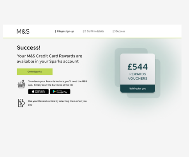
The redesign focused on one goal: make the path from email to active Sparks account impossible to lose. Three screens, a clear progress stepper, and a reward-forward confirmation that gives users an immediate reason to complete the flow.
App Store and Google Play badges only appear on the success screen after the reward is confirmed. Asking earlier would have introduced friction before trust was established.
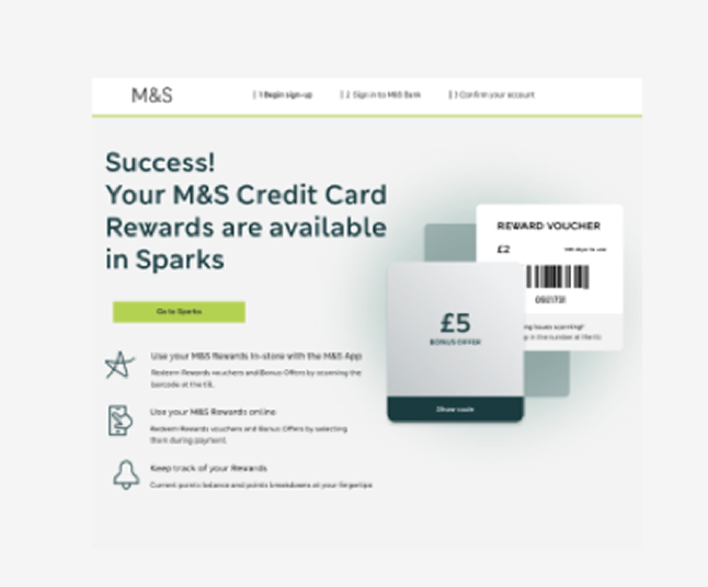
Three benefit icons explain what Sparks unlocks — in store, online, and tracking. Sets expectations before the app download ask.
Full reward value displayed. App Store and Google Play badges appear at the moment of highest motivation — immediately after the reward is confirmed.
Design decisions
Users always know where they are and how much is left. Research showed the original flow had no signposting — users didn't know if they were halfway through or just starting.
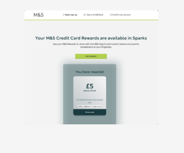
The voucher card appears on screen 1, before the user has committed to anything. This addresses the drop-off caused by users not understanding what they'd receive.
App Store and Google Play badges only appear on the success screen — after the reward is confirmed. Asking earlier would have introduced friction before trust was established.